As email marketing continues to evolve, one of the most significant shifts in recent years has been the growing adoption of dark mode by users across various devices and email clients. Dark mode, a feature that changes the background to darker shades while keeping text light, has rapidly gained popularity for its aesthetic appeal and ability to reduce eye strain. This trend, however, presents both challenges and opportunities for email marketers.
Ensuring that email designs are optimized for both light and dark modes is crucial for maintaining readability, enhancing user experience, and improving overall engagement. In this article, we will explore the impact of dark mode on email design, deliverability, and how marketers can adapt their strategies to accommodate this evolving trend.
Understanding Dark Mode: Trends and User Adoption in Email Clients

Dark mode has become one of the most popular features in modern email clients, with an increasing number of users opting for this viewing mode to reduce eye strain, save battery life, and improve the overall user experience. This trend has had a significant impact on how email marketers and designers approach email design. Understanding the rise of dark mode and its effects on email interactions is crucial for creating effective and engaging email campaigns.
Overview of Dark Mode in Popular Email Clients
Dark mode is a display setting that uses a dark background with light text, which is the opposite of the traditional light mode where dark text appears on a light background. Many popular email clients, including Gmail, Apple Mail, Outlook, and others, now support dark mode for emails.
For instance, Gmail and Apple Mail have implemented dark mode as an optional setting that users can switch to in order to reduce the amount of blue light emitted by their screens. This feature has been particularly appreciated by users who prefer a more visually comfortable experience, especially in low-light environments. Microsoft Outlook, too, allows users to toggle between light and dark modes, accommodating user preferences across various platforms.
As these email clients continue to gain traction among users, the demand for dark mode compatibility in emails is rising. Marketers need to recognize that many recipients might be viewing their emails in dark mode, which requires careful consideration when designing email content.
How Dark Mode Has Gained Popularity Among Users
Dark mode’s popularity has skyrocketed due to its numerous benefits, both in terms of aesthetics and functionality. One of the primary reasons for its rapid adoption is that dark mode reduces eye strain, particularly in low-light environments. Since email users often read messages on mobile devices or at night, dark mode provides a more comfortable reading experience.
Another reason for its widespread appeal is that dark mode can help extend battery life on devices with OLED screens. OLED screens use less power when displaying darker colors, meaning that dark mode can conserve energy and make devices last longer between charges, a crucial feature for users who rely on their phones for extended periods.
With over 80% of iOS and Android users reportedly preferring dark mode, the shift toward this mode is inevitable. As a result, email designers must now cater to a broad audience of dark mode users to ensure their campaigns remain effective and visually appealing.
Statistics and Trends on Dark Mode Adoption and Its Impact on Email Engagement
According to various studies, dark mode adoption is on the rise, with nearly 60% of email recipients using dark mode at least some of the time. This growing trend has significant implications for email design and marketing. Emails that don’t display well in dark mode can result in poor user experiences, leading to higher bounce rates and lower engagement.
Moreover, research shows that emails optimized for dark mode can see higher engagement rates, with recipients spending more time reading emails that are visually appealing in their preferred mode. This is especially true for those using mobile devices, as dark mode tends to enhance readability and prevent screen glare. As email clients continue to refine dark mode features, marketers need to prioritize testing and optimizing their email designs for both dark and light modes to ensure maximum engagement.
In conclusion, dark mode adoption is a growing trend that significantly impacts email design and user experience. As more users embrace dark mode in email clients like Gmail, Apple Mail, and Outlook, marketers must adapt their email designs to ensure that their messages are visually appealing and easily readable in both light and dark modes. By staying on top of these trends and incorporating dark mode best practices, email marketers can improve engagement and ensure their emails are delivering a seamless experience to their audience.
Designing Emails for Both Light and Dark Mode: Key Best Practices

As dark mode becomes increasingly popular among email users, marketers must design emails that look great and perform well in both light and dark modes. This requires careful attention to design elements such as background colors, images, fonts, and call-to-action (CTA) buttons. By optimizing these aspects, marketers can ensure that their emails are visually appealing and effective for all recipients, regardless of their display mode preferences.
How to Ensure Your Email Design Looks Great in Both Light and Dark Modes
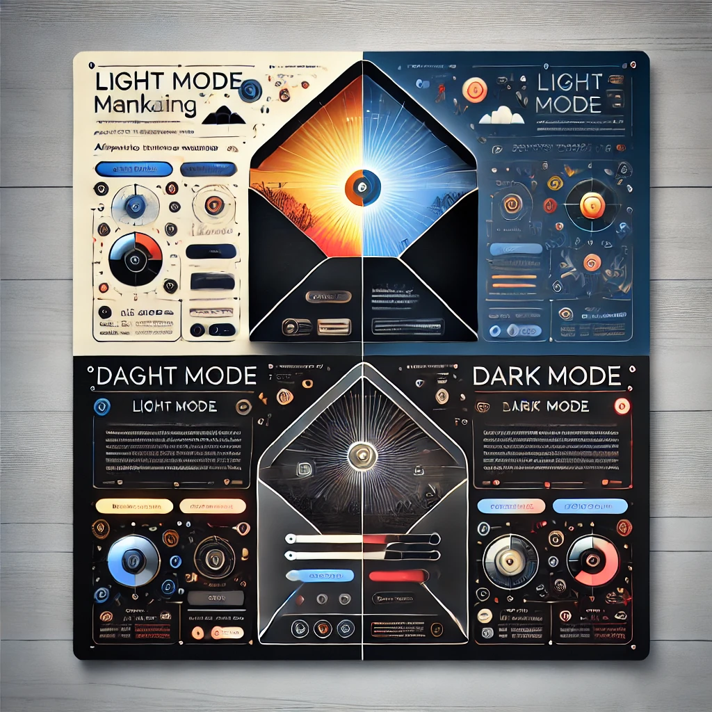
To create an email that performs well in both light and dark modes, it’s essential to account for the potential differences in how the email will appear. In dark mode, email clients invert colors, which can affect elements like background colors, text, and images. For example, a light-colored background in light mode might turn into a dark color in dark mode, making text difficult to read. To avoid this, designers should:
- Use Transparent Backgrounds: Instead of solid background colors, use transparent or semi-transparent backgrounds for images or blocks of color. This way, the email’s background color won’t clash when users switch to dark mode.
- Ensure Sufficient Contrast: Whether the email is viewed in light or dark mode, the text should always be readable. Ensure there is enough contrast between text and the background, especially in dark mode where dark backgrounds can make text hard to read. Using dark text on light backgrounds or light text on dark backgrounds is crucial for clarity.
- Test for Compatibility: Email clients automatically adjust certain elements in dark mode, but it’s important to test your email in both modes to ensure it appears as intended. Ensure that the design doesn’t appear overly dark, and check that key elements like CTA buttons remain visible and enticing.
Key Design Elements to Consider: Background Colors, Images, Fonts, and CTA Buttons
When designing emails for both light and dark modes, consider the following key elements:
- Background Colors: Avoid using dark backgrounds unless absolutely necessary. Dark backgrounds in dark mode can result in reduced visibility for text and other design elements. Stick to light backgrounds or use gradient colors that transition smoothly in both modes.
- Images: Images can often look dramatically different in dark mode, with certain parts of the image appearing too dark. To address this, use images with higher contrast and ensure they work well with both backgrounds. Also, consider using inline styles or backgrounds with images that don’t rely on pure black or white.
- Fonts: Font choices are important for readability in both modes. Stick to sans-serif fonts for better readability and avoid fonts that might blend into the background in dark mode. Also, ensure font colors contrast well with both light and dark backgrounds.
- CTA Buttons: Ensure that CTA buttons stand out and maintain their visibility in both light and dark modes. A bright color like blue or orange works well for CTA buttons, but avoid dark-colored buttons, as they may be hard to see in dark mode.
Tools and Techniques for Testing Email Designs in Dark Mode Before Sending
Before sending emails, testing across different devices and email clients is essential to ensure compatibility. There are several tools and techniques available to check how your email design will appear in dark mode:
- Email Testing Platforms: Tools like Litmus and Email on Acid allow you to preview your emails in various email clients, including those with dark mode support. These tools simulate how your design will appear in dark mode, helping you catch any issues before the email is sent out.
- Manual Testing: Test your email on multiple devices, including mobile and desktop, to see how it appears in both light and dark modes. Make adjustments as necessary to ensure that all key design elements, including text, buttons, and images, are properly displayed.
- A/B Testing: Conduct A/B testing with different design versions for light and dark modes. By sending out variations of the email, you can gather data on how each version performs and make improvements accordingly.
In conclusion, designing emails for both light and dark modes requires thoughtful attention to background colors, images, fonts, and CTA buttons. By ensuring contrast, testing for compatibility, and using the right tools, marketers can create visually appealing and effective emails that engage recipients regardless of their display mode preferences.


